Brand Identity
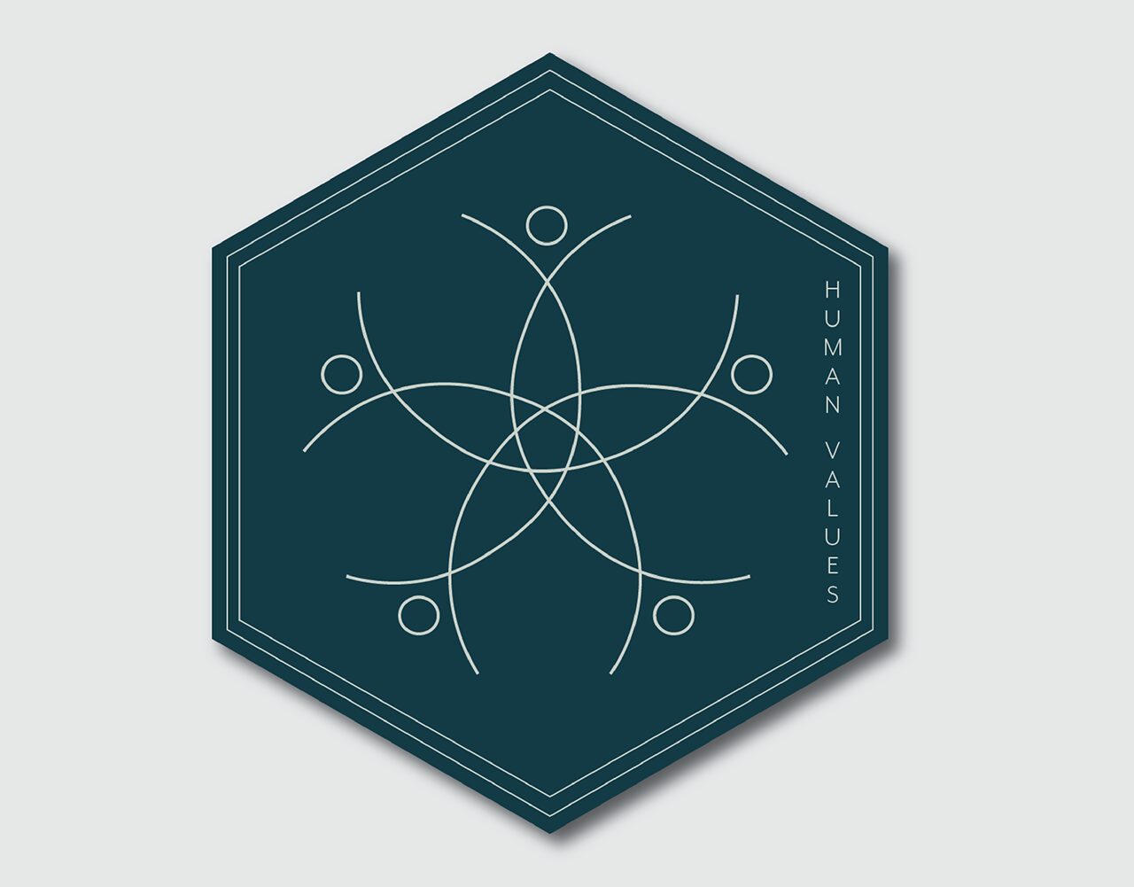
Human Values
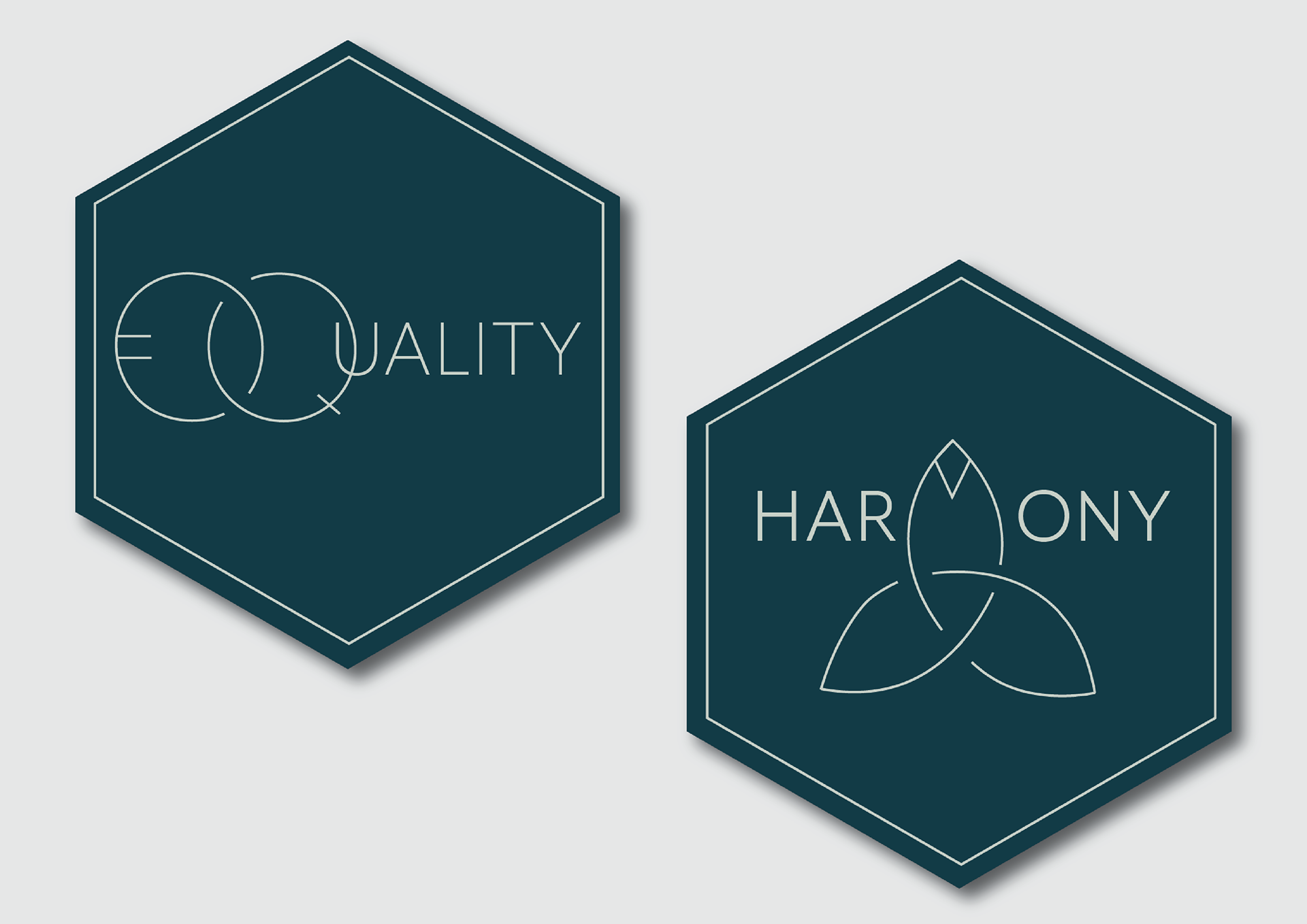
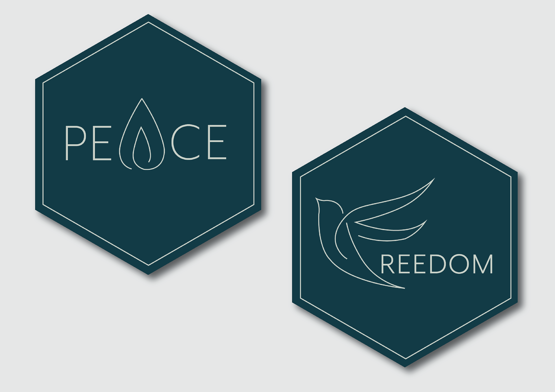
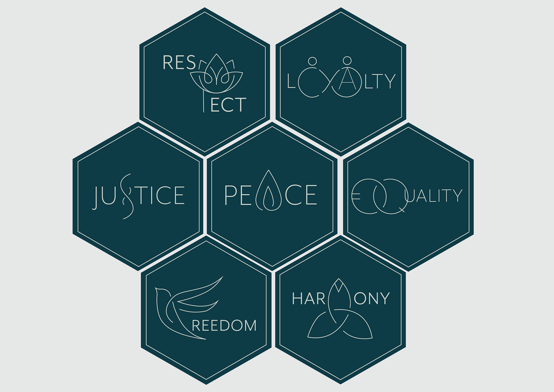
Identity work built around clarity, calm and considered hierarchy.
- Role
- Identity design, typographic system, applications
- Disciplines
- Branding, Digital
The challenge
Values-led organisations tend to accumulate a lot of message at once. Without a firm hierarchy, every application ends up equally weighted and nothing gets read.
The approach
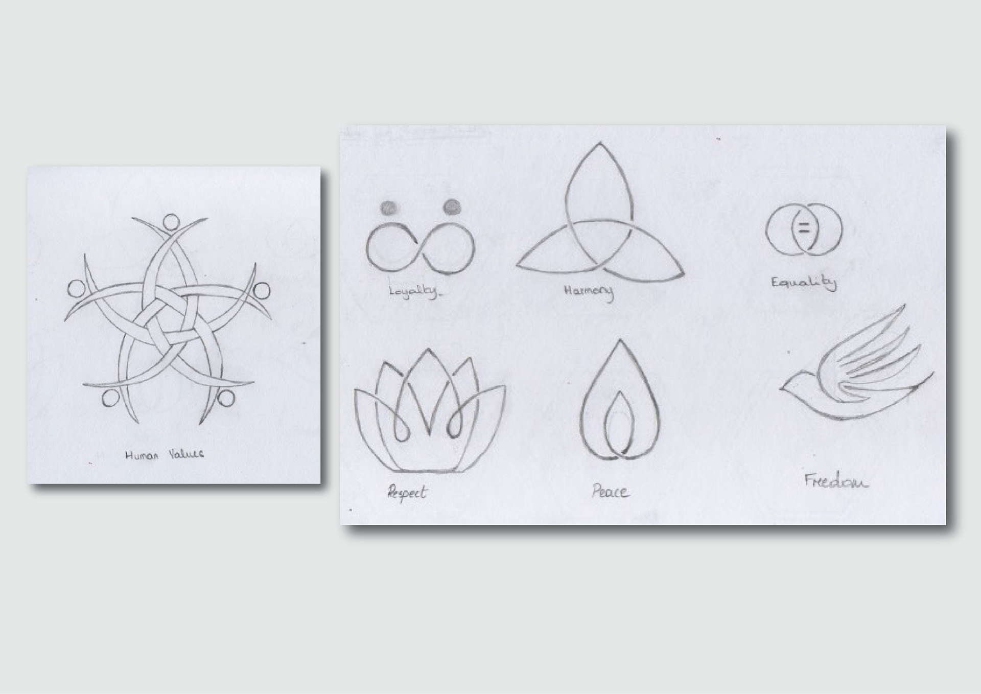
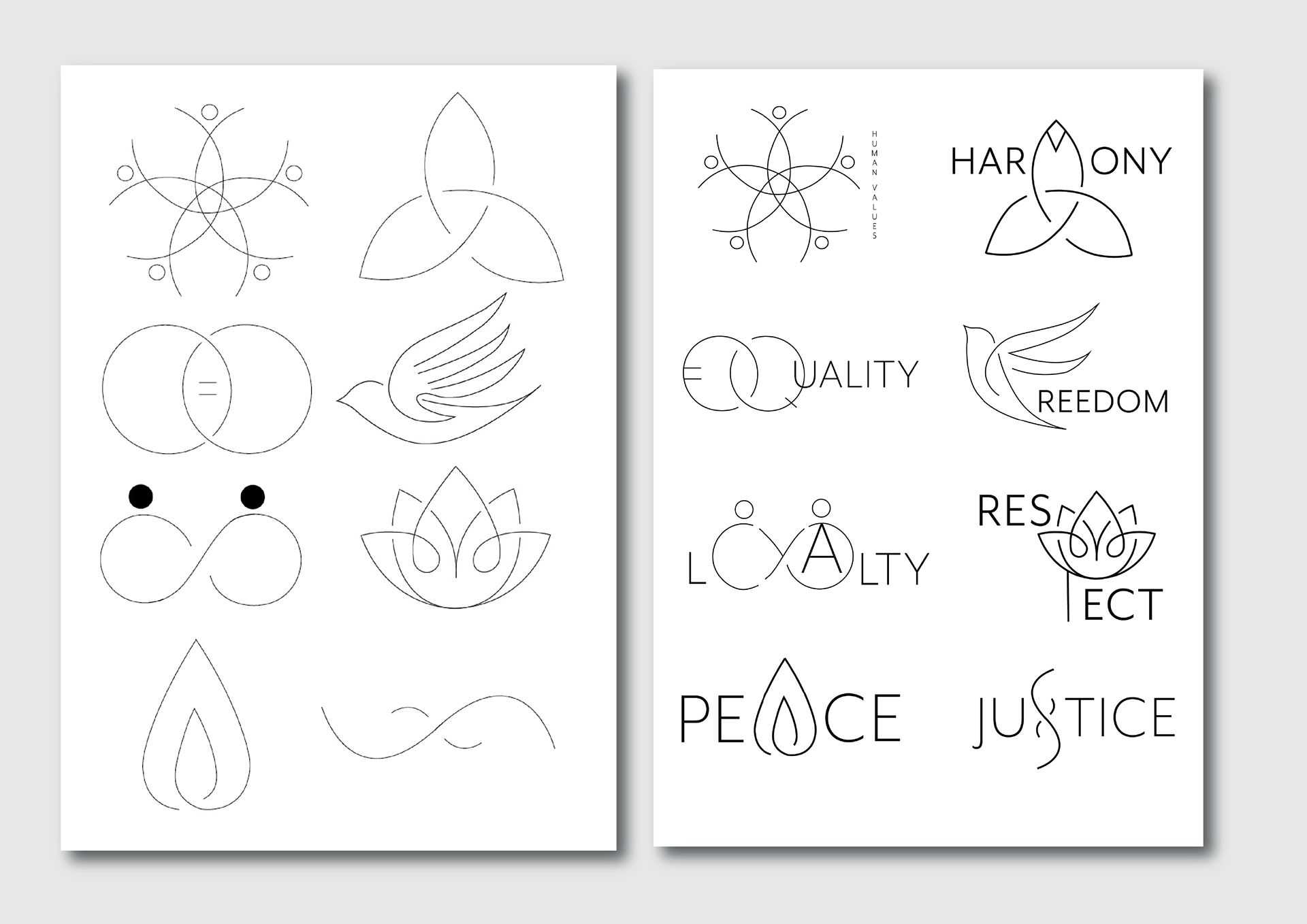
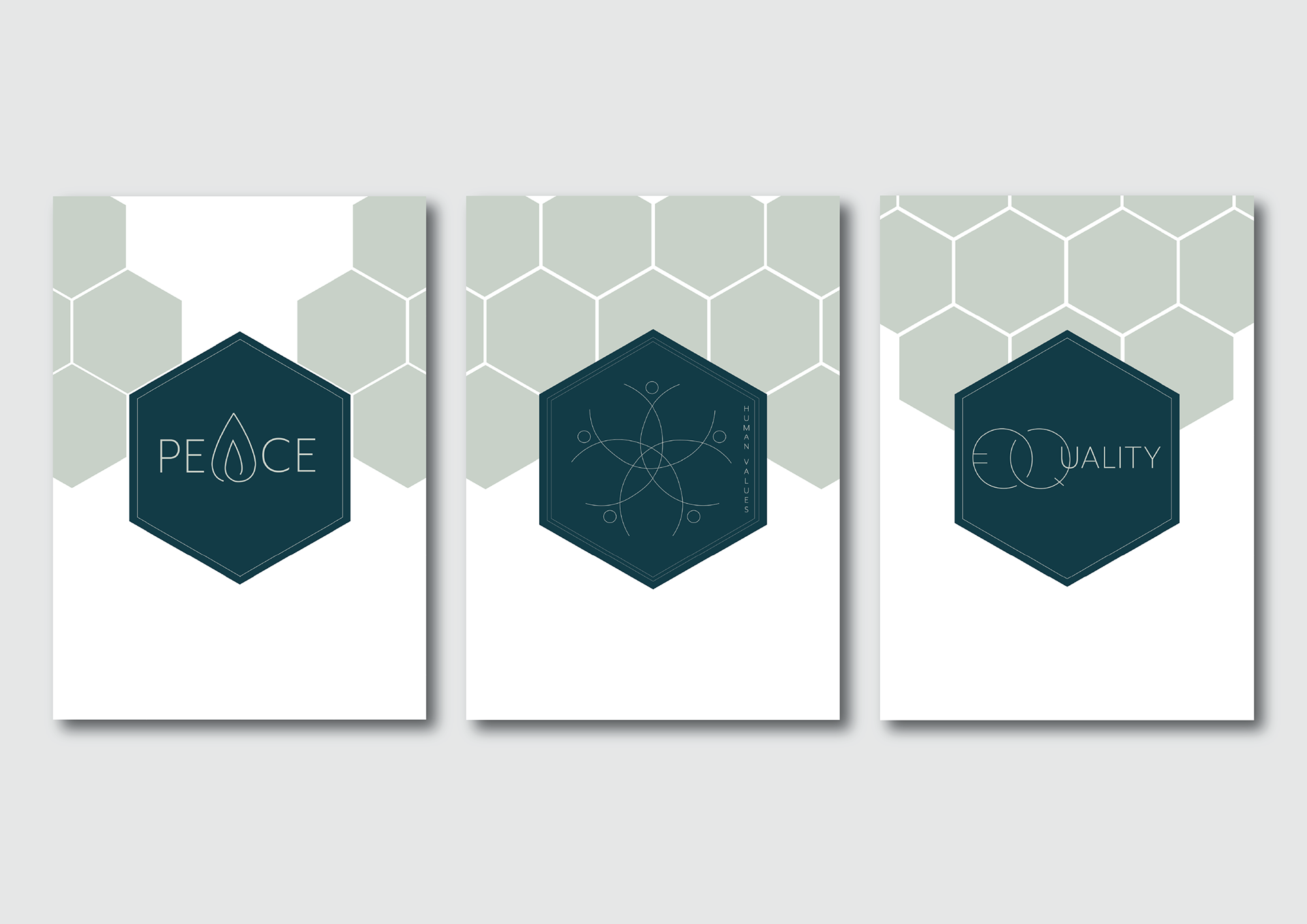
We built the identity around a strict three-level hierarchy — one statement, one supporting line, one action — and held it across every application. The palette is deliberately narrow so colour carries meaning rather than decoration, and the type system uses two weights of a single family, which keeps applications consistent when produced by someone other than a designer.
The outcome
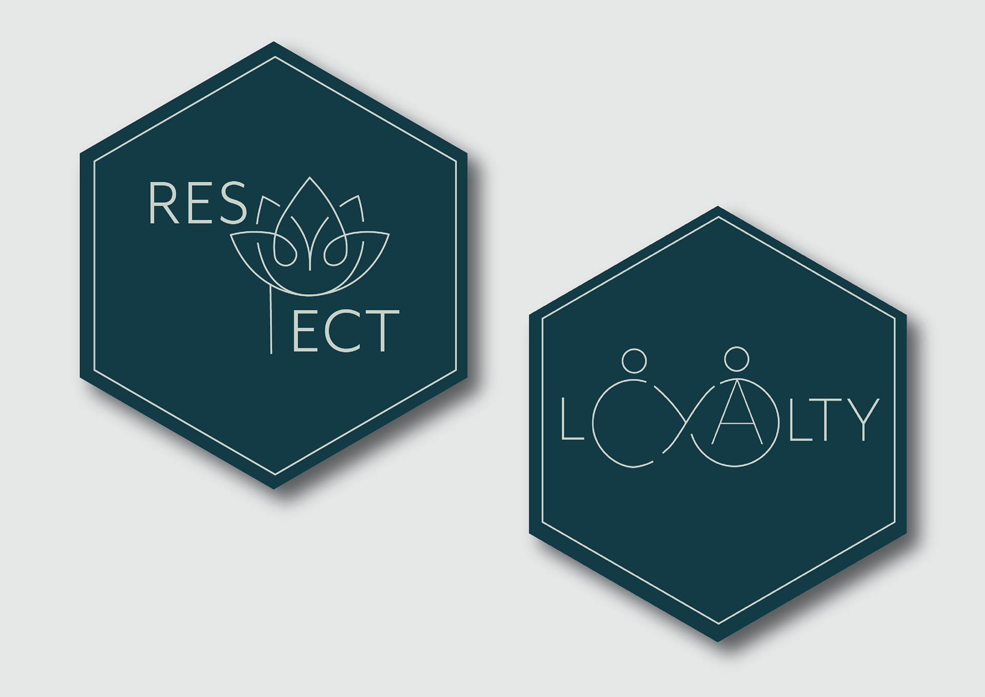
The system makes the important thing visibly the important thing in each piece, and is simple enough to hand over. Rollout and results to be confirmed.
Share