Skip to content
Pick Your Leaves brand identity presentation showing logo, packaging labels and a soft botanical colour palette

Brand Identity

Pick Your Leaves

Brand identity and visual language for an independent loose-leaf tea project.

Role
Brand identity, logo, packaging visuals
Disciplines
Branding, Print, Digital

The challenge

An independent tea project needed an identity that felt considered and craft-led rather than corporate, and that would still hold up printed small — on labels, tags and pouches — where fine detail disappears.
The Pick Your Leaves wordmark in white with a leaf mark, on a deep blue ground

The approach

We kept the mark simple enough to survive at label size, and let the personality come from the supporting system instead: a soft botanical palette, a restrained type pairing, and lots of unprinted space around each element. Packaging layouts repeat the same two type sizes and one alignment rule, so a range of blends stays visually related without needing a new design for each.
Pick Your Leaves logo shown large in white on a deep blue ground

The outcome

The identity gives the project a consistent shelf presence that scales across blends, and can be extended by non-designers without breaking. Rollout details to be confirmed.
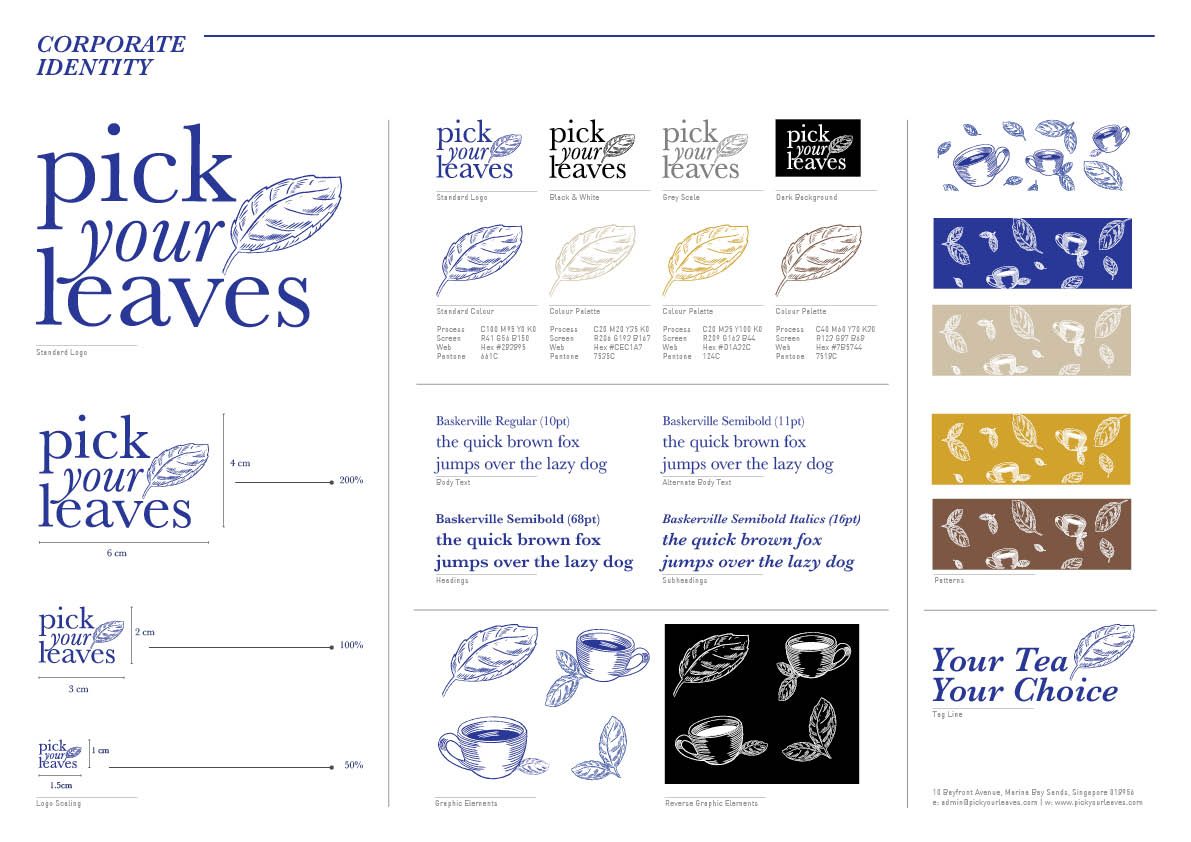
Corporate identity board showing the Pick Your Leaves logo variants, colour swatches and teacup illustrations
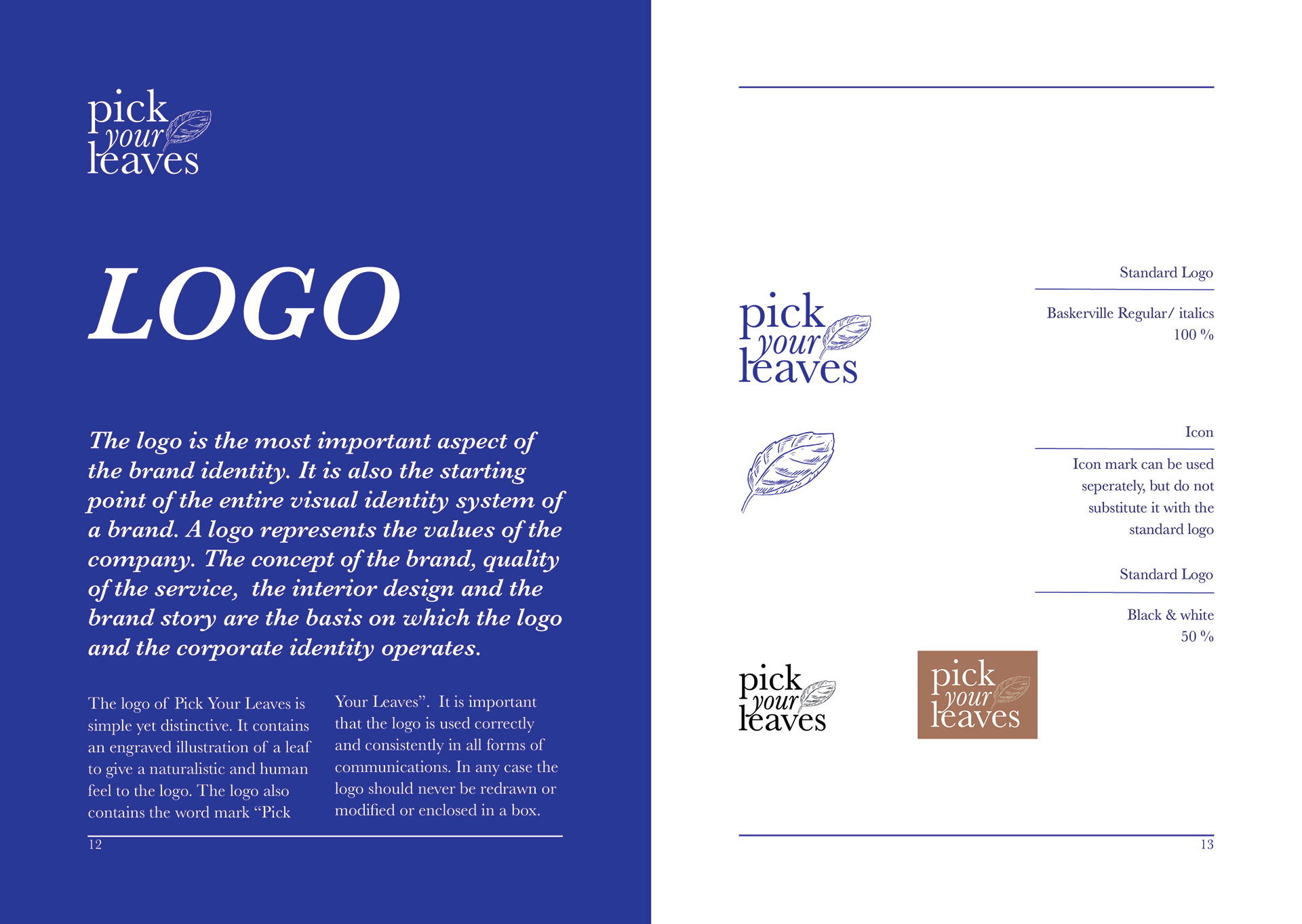
Brand manual page setting out the logo and its construction
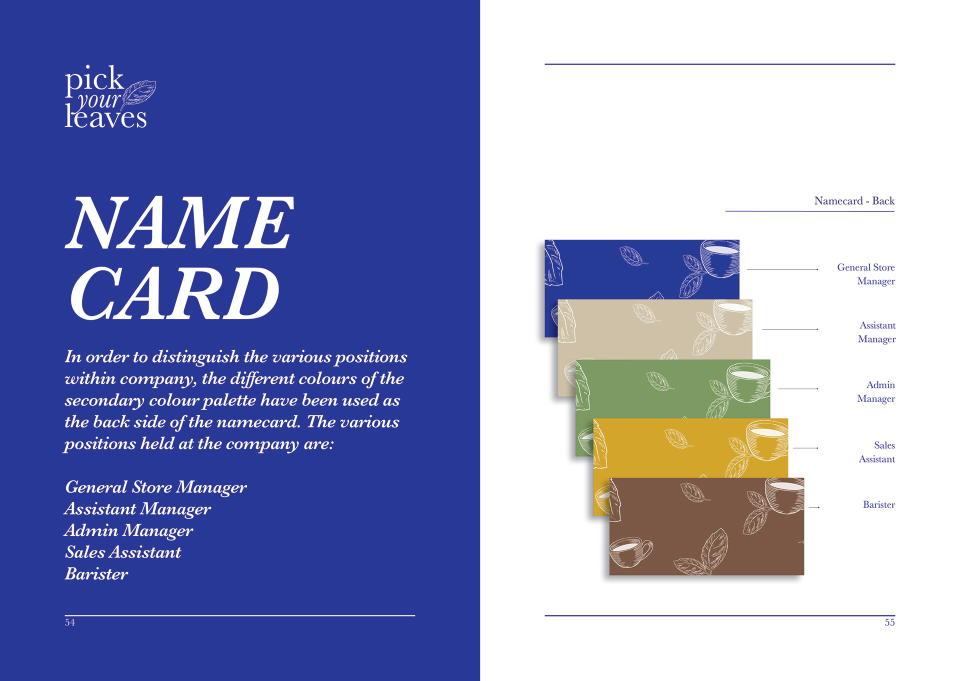
Brand manual page showing the name card layout
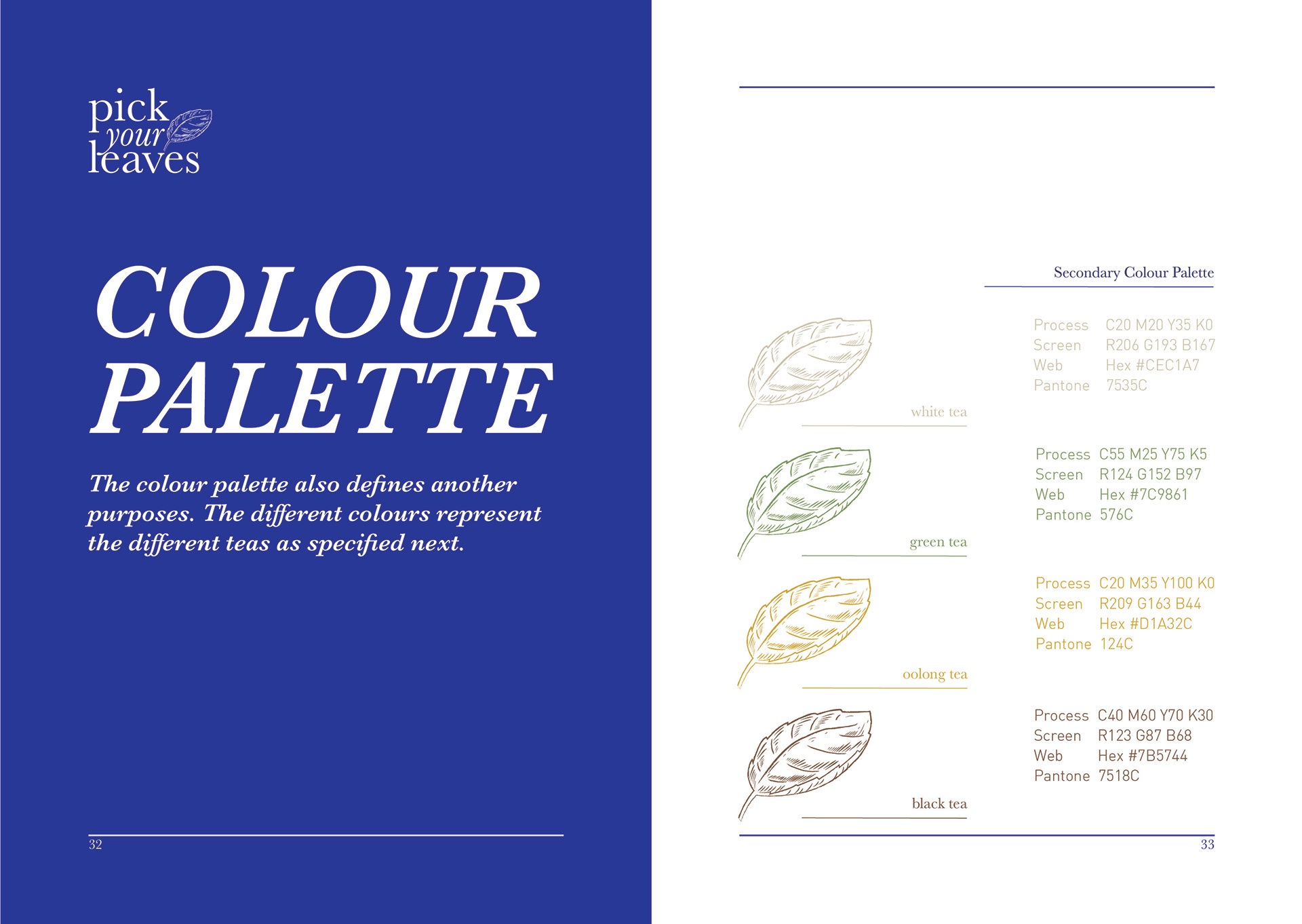
Brand manual page showing the brand colour palette
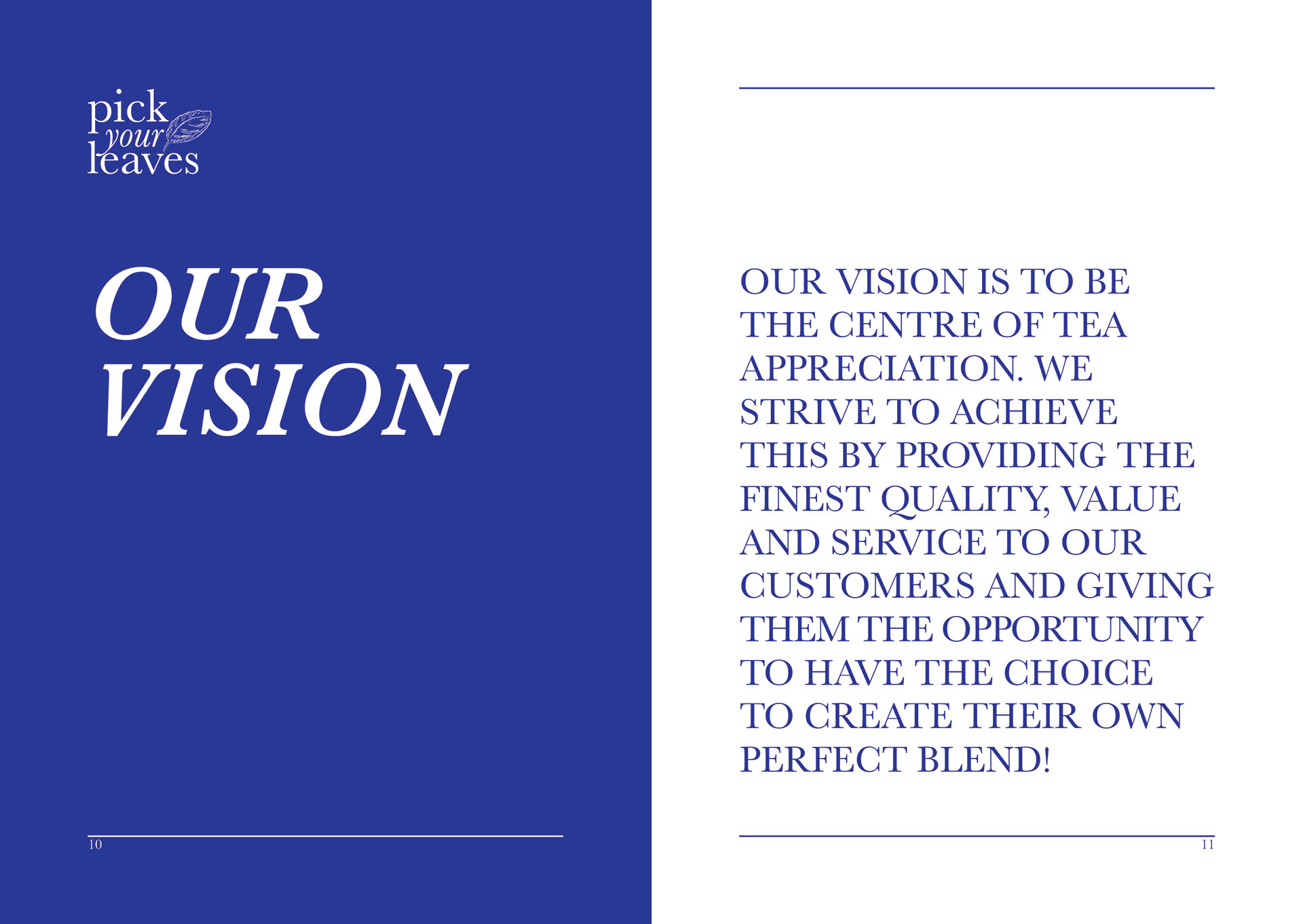
Brand manual page setting out the brand vision
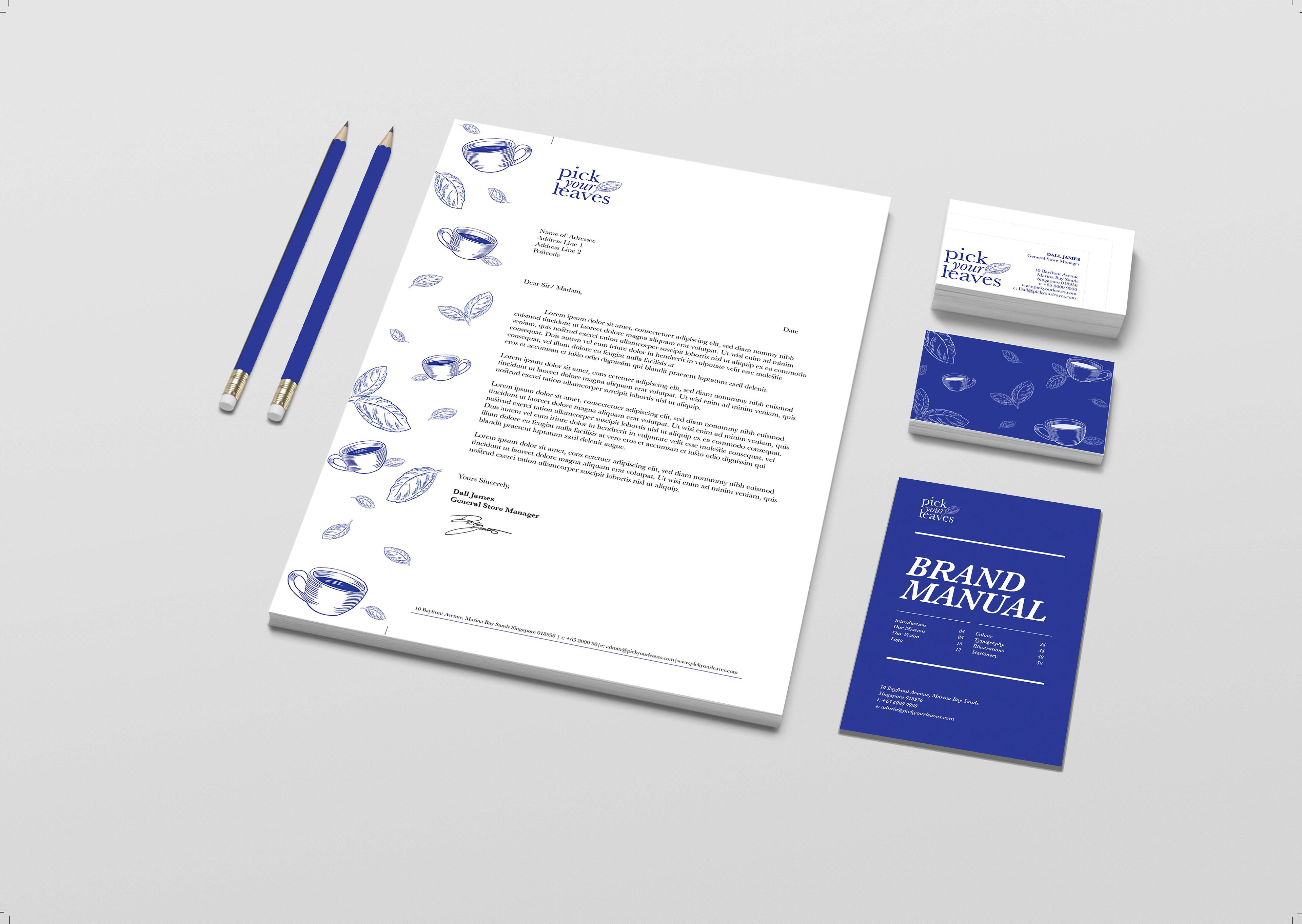
Pick Your Leaves stationery set shown together, including printed items in the brand blue
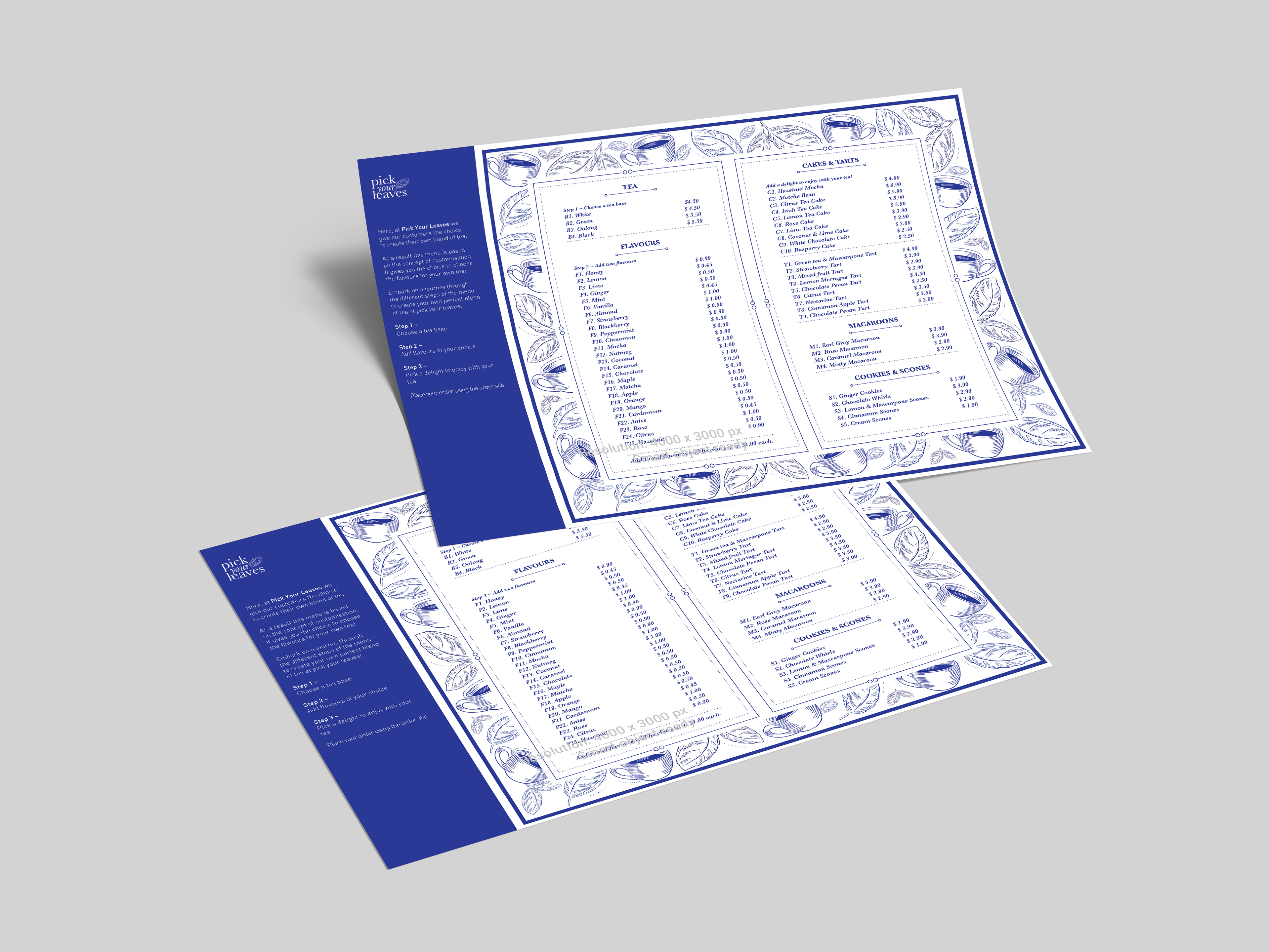
Folded Pick Your Leaves menu shown standing
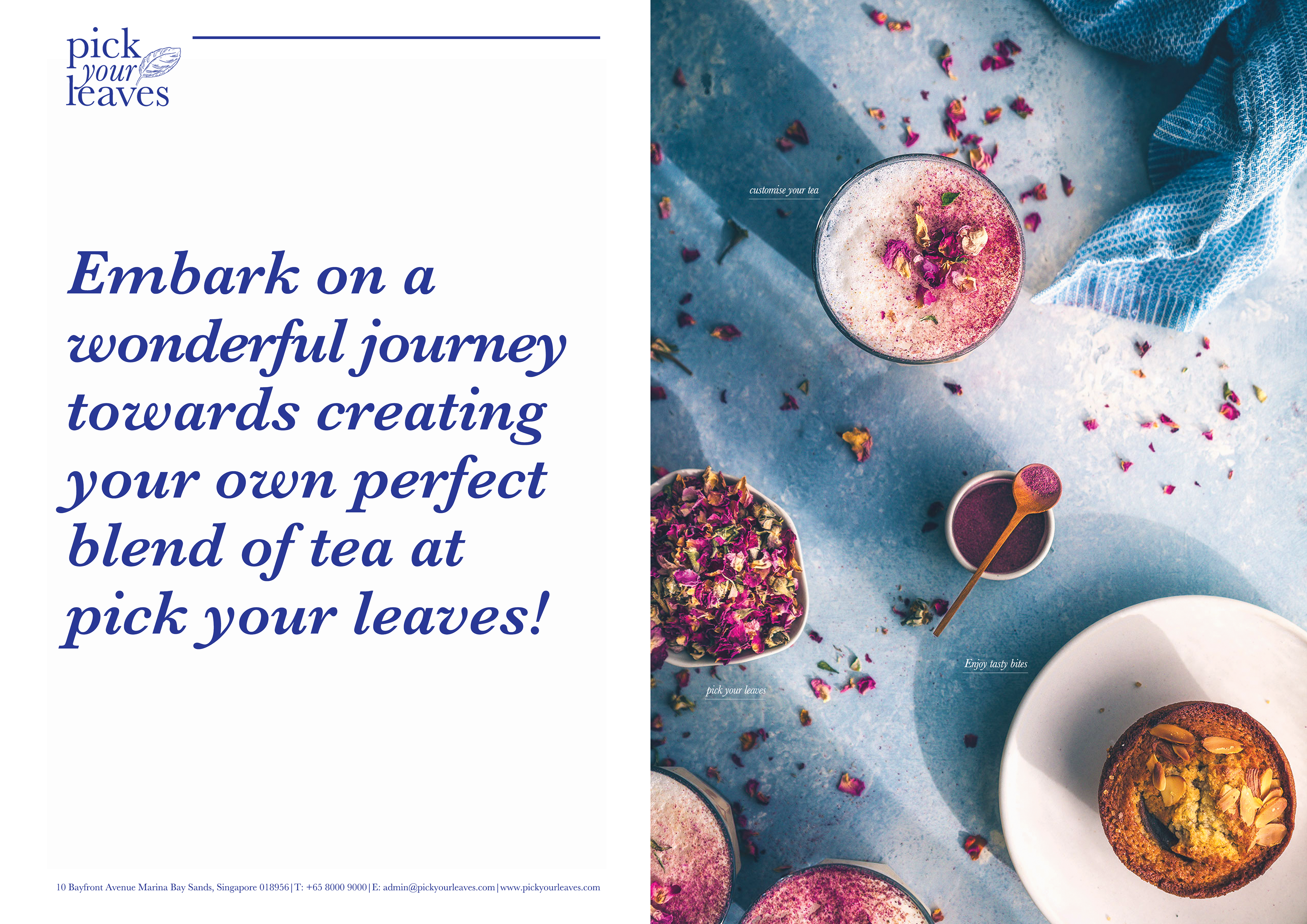
Pick Your Leaves brochure shown open across its folded panels
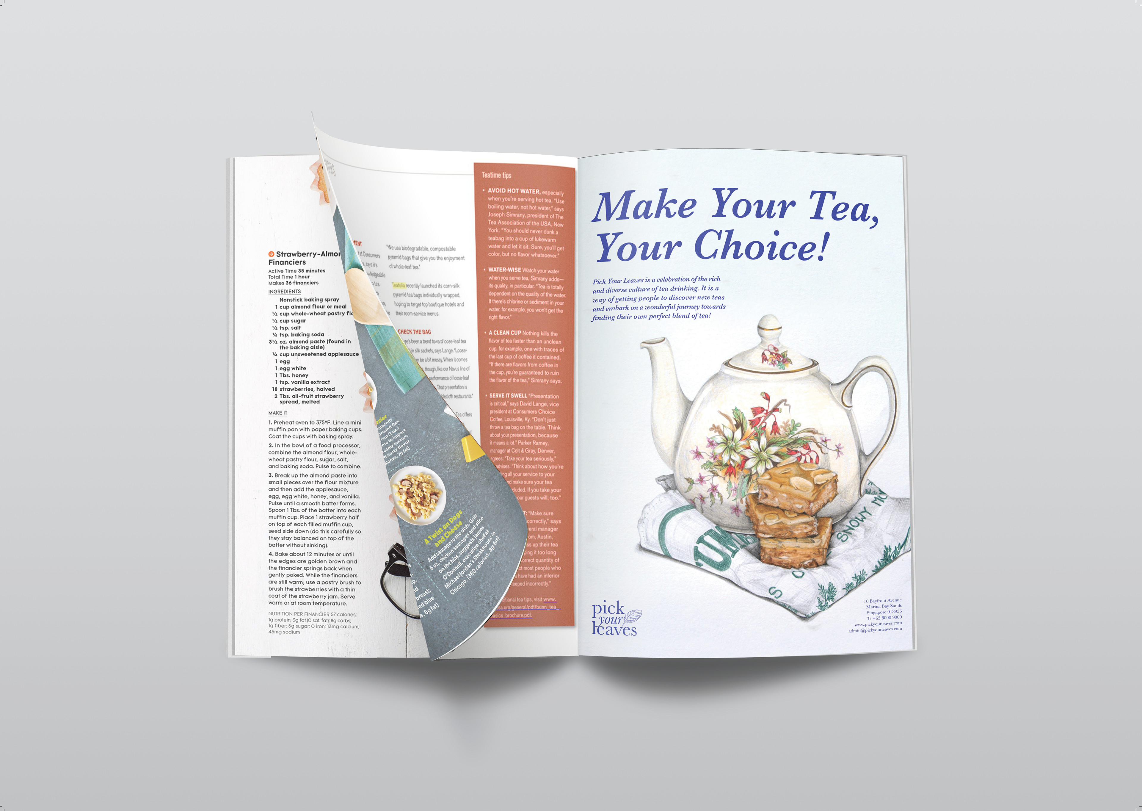
Pick Your Leaves poster design
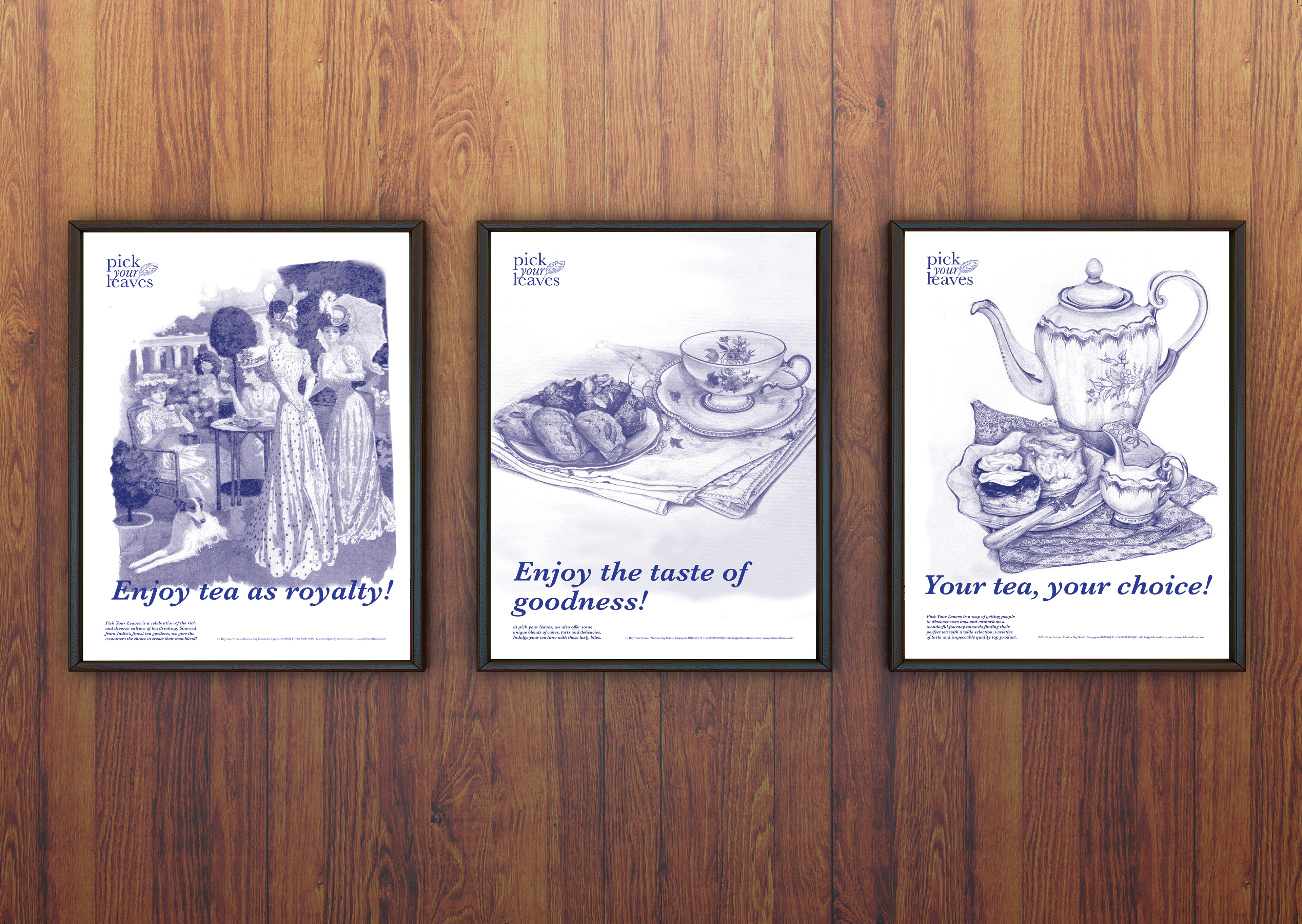
Pick Your Leaves prints shown framed on a wooden surface
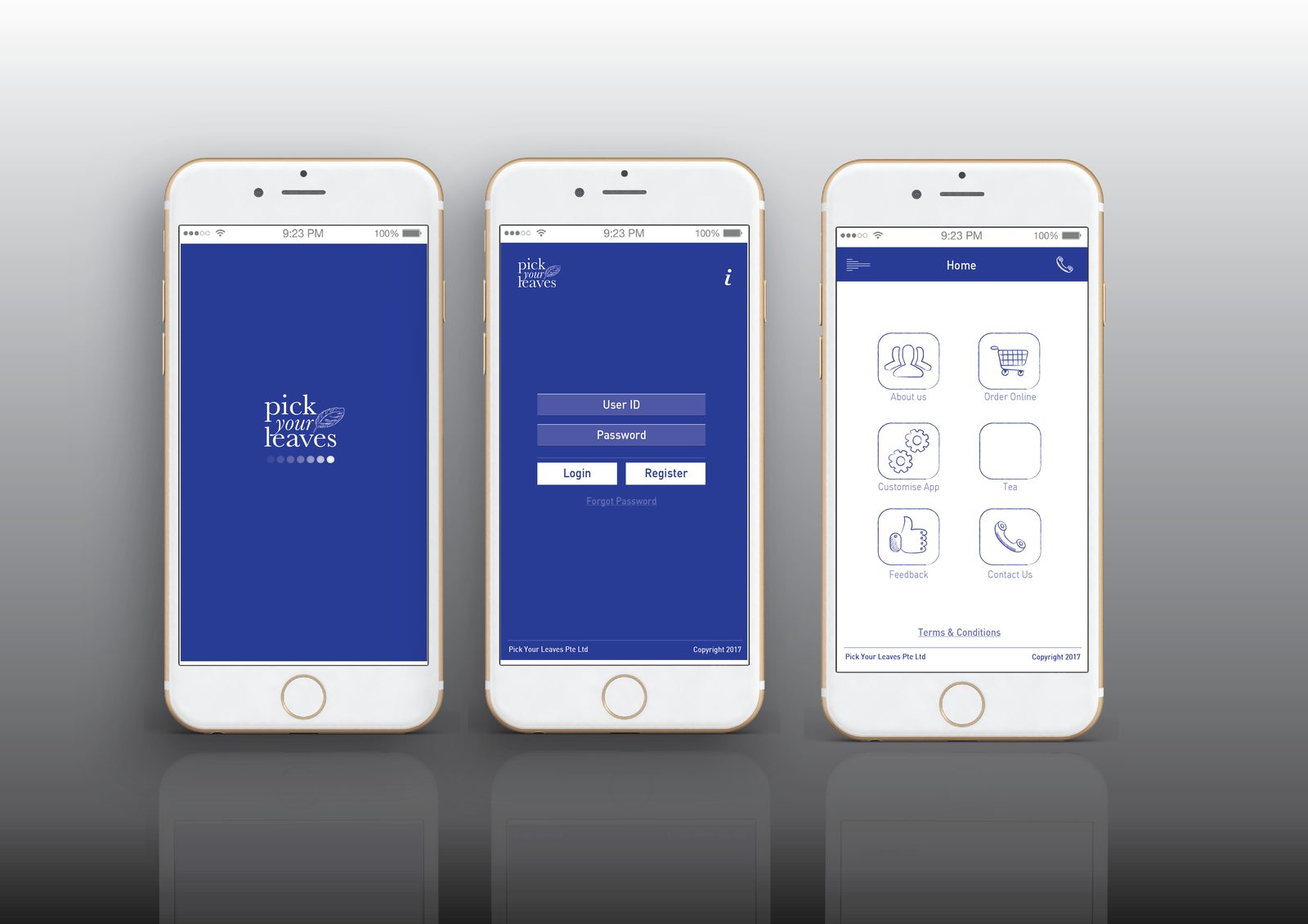
Three phone screens showing the Pick Your Leaves app sign-in and ordering flow
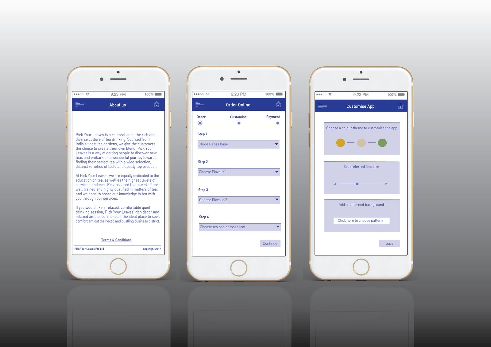
Three further phone screens showing the Pick Your Leaves app content and settings

Share